After the tumult of 2020, everyone is looking forward to a fresh start and ways to liven up surroundings that might feel a little too familiar at this point. Paint companies are definitely incorporating this into their palettes for the new year. Let’s look at what they’ve selected for 2021.
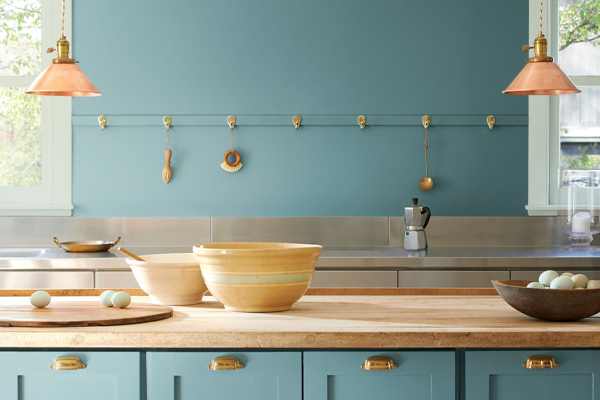
Aegean Teal by Benjamin Moore
Aegean Teal by Benjamin Moore
Benjamin Moore chose a soft, calming blue-green for their color of the year. Aegean Teal is a perfect combination of soothing blue and lively green, with a gray undertone to keep it feeling contemporary Hannah Yeo, color marketing and development manager at Benjamin Moore, calls it “an intriguing blue-green that creates natural harmony and invites us to take a moment to reflect and reset.” Sounds like just what we need this year.
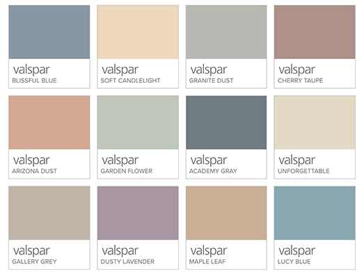
Valspar 2021 Colors of the Year
Valspar 2021 Colors of the Year
Just like last year, Valspar didn’t limit themselves to just one color for 2021, but selected a whole palette of comforting, muted colors. Varying in tone from Blissful Blue to Cherry Taupe, the hues were chosen to feel cozy and comfortable. “Our homes have become offices, entertainment centers, and classrooms, which means the colors, sights, and sounds in our rooms have an even bigger impact on our daily lives,” says Valspar color marketing manager Sue Kim. Increased time at home in 2020 saw a surge of home improvement projects and an increased interest in how our surroundings make us feel. Valspar’s 2021 colors aim to help you feel serene and tranquil.
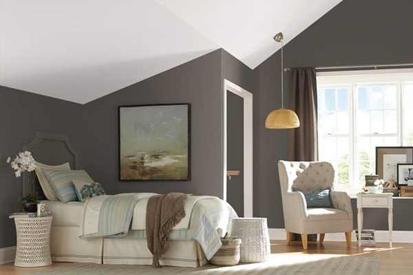
Urbane Bronze by Sherwin-Williams
Urbane Bronze by Sherwin-Williams
Bucking the trend of other paint companies that put forward light, muted tones, Sherwin-Williams selected a rich, bold neutral as its 2021 color of the year. Urbane Bronze is a warm shade of gray-brown meant to answer our current desire for stability. “The home is now the ultimate retreat from the world, and color is an easy and effective way to create a personal haven,” said Sue Wadden, director of color marketing at Sherwin-Williams. Urbane Bronze is a dark, natural color that is reminiscent of burnished metal or stone, giving it a timeless look and feel.
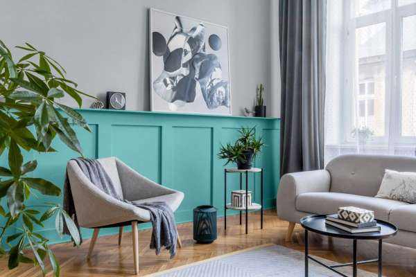
Aqua Fiesta by Glidden
Aqua Fiesta by Glidden
Glidden put a twist on its annual paint color by announcing its first-ever accent color of the year. Aqua Fiesta is a bold, fresh aquamarine designed to make an accent wall really pop. It’s such a vibrant color that it packs a punch even in small doses such as on millwork or cabinetry, and works well when combined with other neutral colors. If you’ve been dissatisfied with your home’s color scheme but haven’t been able to decide on a new palette, Glidden has the solution for you: “We have gone one step further to help you stop procrastipainting by unveiling Aqua Fiesta as the go-to accent color,” said Amy Donato, Glidden paint’s color whisperer. If you’re looking for some cheer, give this color a try. And who doesn’t like a fiesta?
Whether you want to find some zen at home or liven up your space, a new paint color can set the atmosphere in your home or the spirit of your brand. Give 2021 a fresh start by rejuvenating your space. Precision Wallcovering can help—give us a call today and discover how easy and affordable your next project can be.